Gajim wastes space on my sceen
Compared to PSI, Gajim uses match more place on screen and isn't possible to make roster more usable by changing spaces between contacts.
You can look on my screenshot
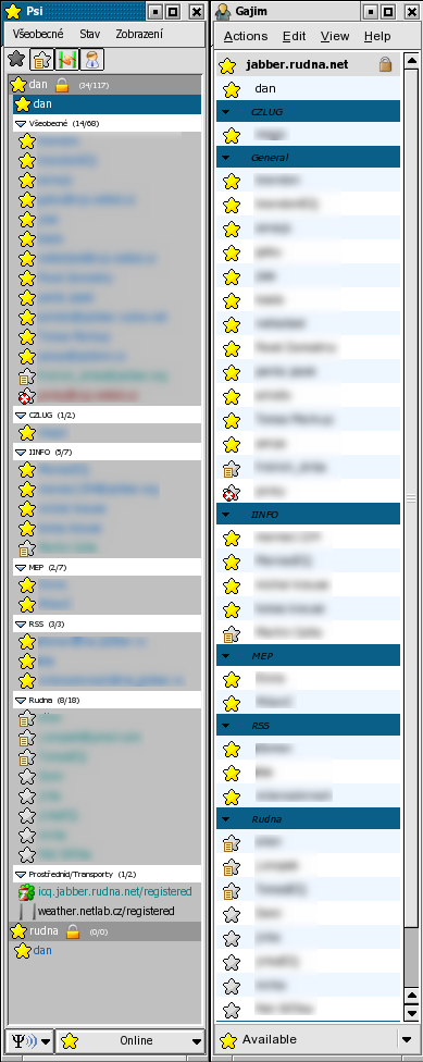
With same iconset, same font size and same functionalities (atavar and status message disabled), the roster in Gajim is about 20% bigger.